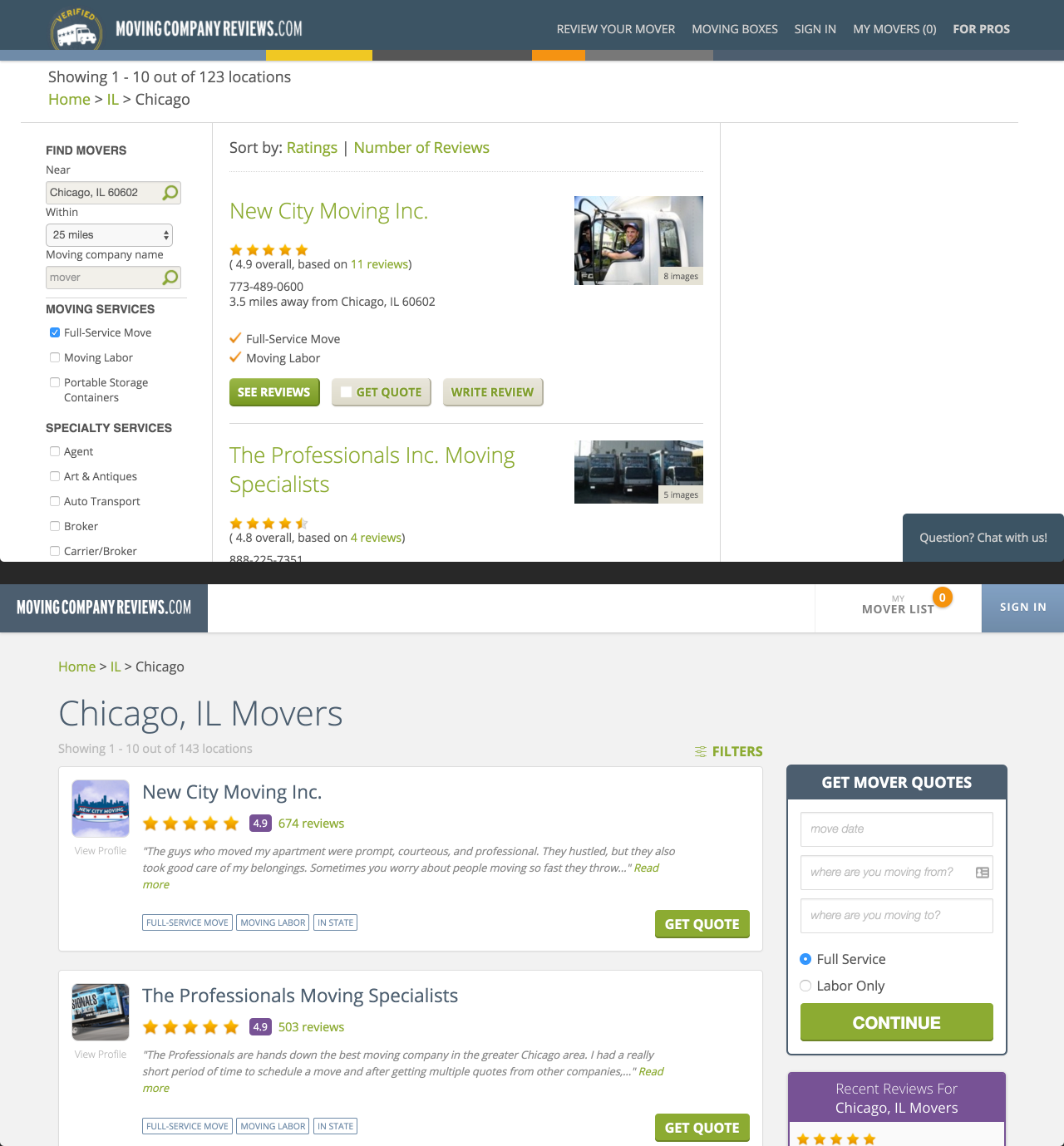

Redesigns of the navigation bar and search results page. This redesign aimed to remedy our unresponsive and cluttered pages. Once the design phase was done, I jumped into our Ruby on Rails application, ripped out the old HTML and CSS and completely recoded each piece.
Top: Old design. Bottom: New design.

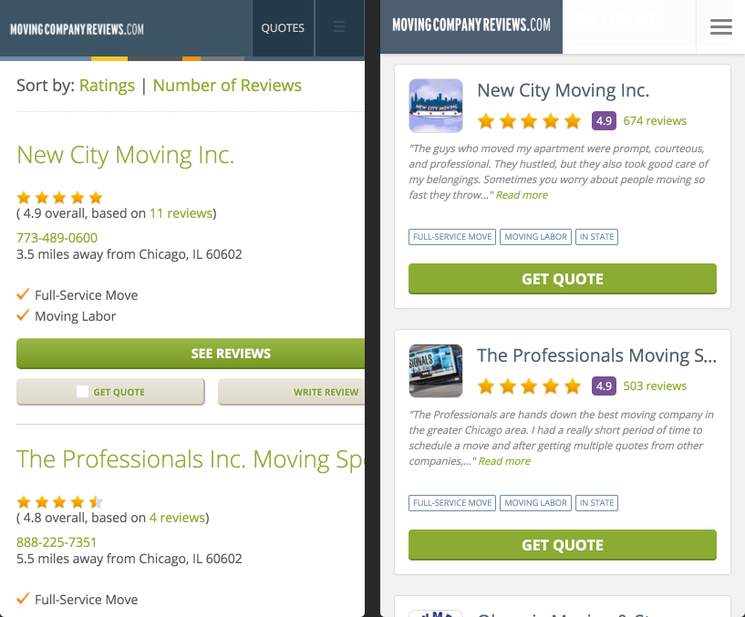
Mobile version of the old vs new navigation bar and search results page. The old version was not mobile-friendly and overly cluttered with information that was not necessary for the user to view. With the redesign, some information was eliminated to accommodate a more aesthetically pleasing search result card.
Left: Old design. Right: New design.

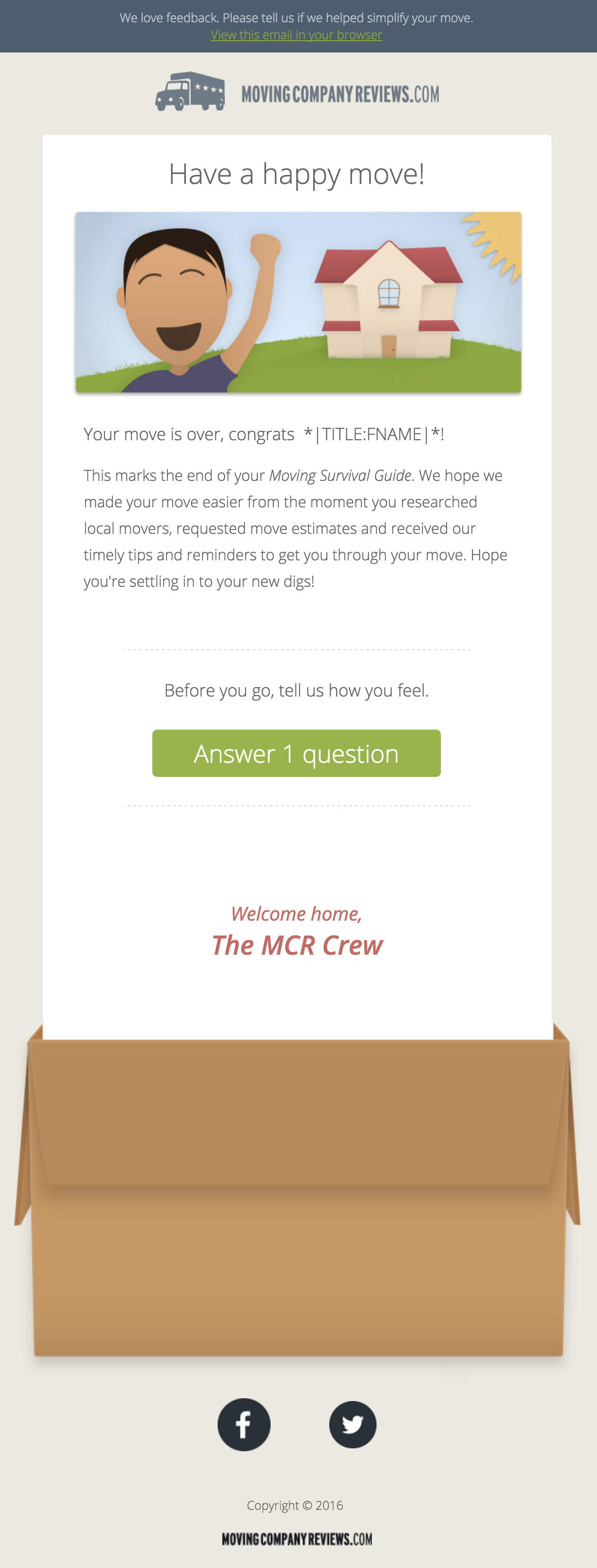
When I joined the team, our emails were a little out of date. We decided that better looking emails could help legitimize our company in the eyes of customers. After a lengthy design process, we finally had nicer, cleaner looking emails that were more in line with our brand. Next, I had to code the email as a reusable email template. Honestly, coding email HTML is one of the most frustrating things due to the fact that it's like coding HTML 30 years ago.

Here is a display of all the email header images I illustrated.

At MovingCompanyReviews, I was both the front-end developer and the graphic designer. Those two disciplines overlap each other frequently. I noticed that our styling in the code was inconsistent with our design guide...which didn't exist! A few weeks later, I designed and coded an entirely new branding guide. Unfortunately, we did not have time to implement it before the company was sold and priorities shifted. Despite that let down, it was a great learning experience.

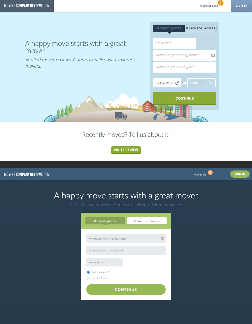
My very last project was to A/B test a new homepage using the newly created style guide. The new design showed a higher conversion rate which supported the idea that a clean UI will in fact intice users to use our site.